
work
Walmart Case Study
Optimizing user feedback with a scalable review template

Overview
I led the redesign of Walmart’s review template, defining which inputs were critical for capturing meaningful insights. To maximize impact, I prioritized key improvements for the MVP, balancing business goals, user needs, and scalability.
Initially an Apparel team initiative, I worked with product and engineering to scale it across all verticals, ensuring alignment with business goals and long-term scalability.
Goals:
Collect actionable, item-specific feedback.
Develop a scalable template adaptable across all verticals.
Improve engagement and completion rates.
Role
Responsibilities
Collaborators
Timeline

The need for a redesign
Due to tight deadlines, Walmart’s 2021 unified site launch included a simplified review form, limiting its value for users and business insights.
Business Need
A scalable template for collecting detailed item and user data across verticals.
User Need
A simple, engaging way to share feedback at any level of detail.
problem to solve
The existing review template is generic, lacking item-specific questions and detailed data, limiting its value for users and the business.
quick_reference_all
Research
Competitive insights
I analyzed over 25 platforms to identify best practices for content, structure, and layout, prioritizing actionable questions, intuitive grouping, and usability.
1
content
What essential details should users provide to make reviews most helpful?
2
organization
How can the form reduce user burden while ensuring quality data?
3
layout structure
What design approach maximizes user completion and submissions?
Competitive analysis
Feature ratings
Companies included a varied number of feature ratings in their forms.
Target: Includes three ratings and requires size-specific questions.
Amazon: Offers optional fields for detailed inputs, to help prevent users from feeling overwhelmed.
personal details asked
Questions included potentially sensitive information of varying degrees.
Shein: Rewards sensitive inputs like height and weight with points.
Glossier: Marks any sensitive fields as optional for user comfort.
presentation format
The formats included a single-page layout, a phased approach using an accordion, and a step-by-step wizard format.
Airbnb and Tripadvisor: Use wizard flows with progress bars to guide users through steps seamlessly. (Tripadvisor uses a different approach on desktop).
J.Crew: A single-page layout with clean sections to avoid overwhelm.
DSW: Accordion sections group inputs but can feel cluttered when too many options are displayed, especially in a modal.
Target

Amazon

Shein

Glossier

Airbnb

Tripadvisor
j.crew

DSW

Answering the key questions
Insights from this analysis informed key design decisions, ensuring scalability and ease of use.
1
content
Focus on critical inputs like ratings, titles, descriptions, photos, and item details.
2
organization
Group similar inputs to reduce cognitive load while prioritizing capturing key data early.
3
layout structure
Use a step-by-step approach with previews to inform users and reduce uncertainty.
How might we
How might we redesign the review template to collect detailed, item-specific feedback while increasing engagement and completion rates?
lightbulb_2
Ideation
Developing concepts
Creating a review taxonomy
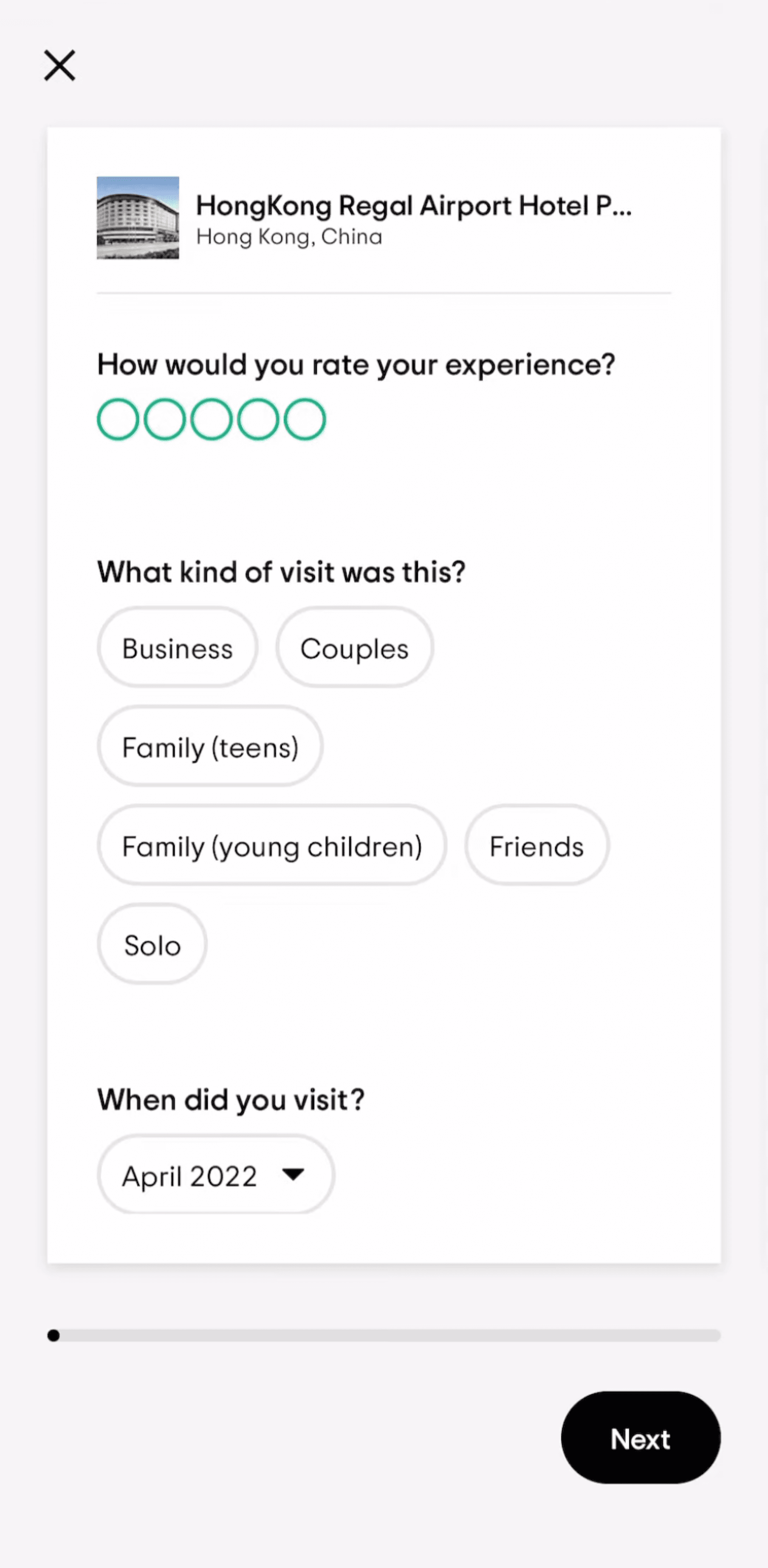
Based on my research, I prioritized key inputs and structured the form to ensure scalability across all verticals. For apparel, I included height and weight to improve fit recommendations, ensuring reviews provided relevant, actionable insights.
Two user flow concepts emerged:
Accordion: A single-page format with collapsible sections for flexibility and visibility into upcoming content.
Wizard: A linear, step-by-step format for guided progression and clarity.
Option 1: Accordion
Section 1
Rate
Section 2
Review
Section 3
Personal details
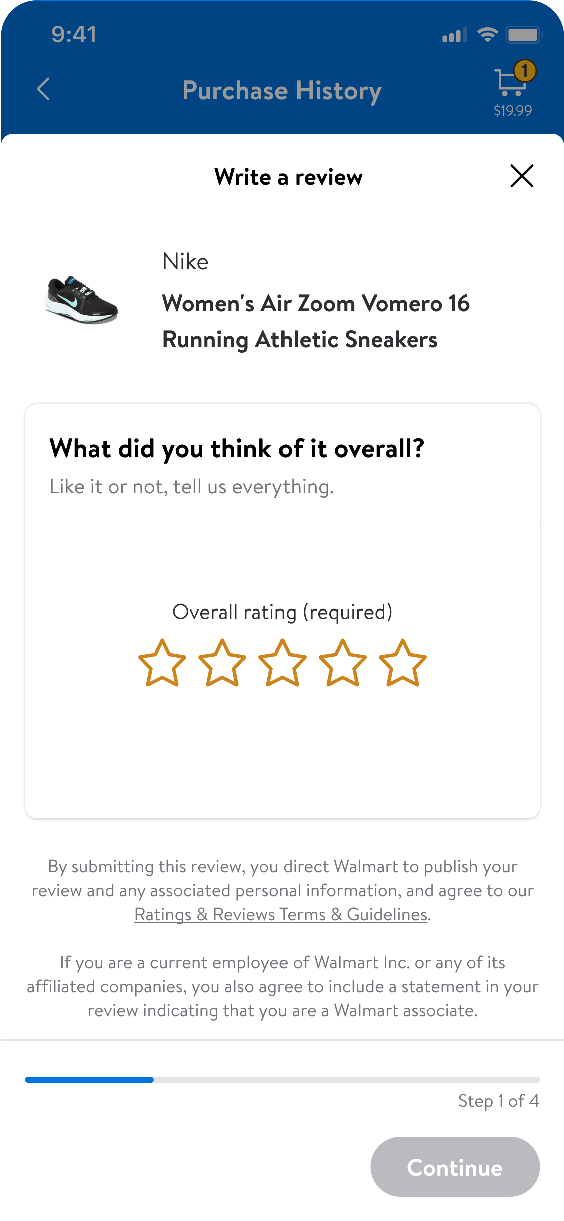
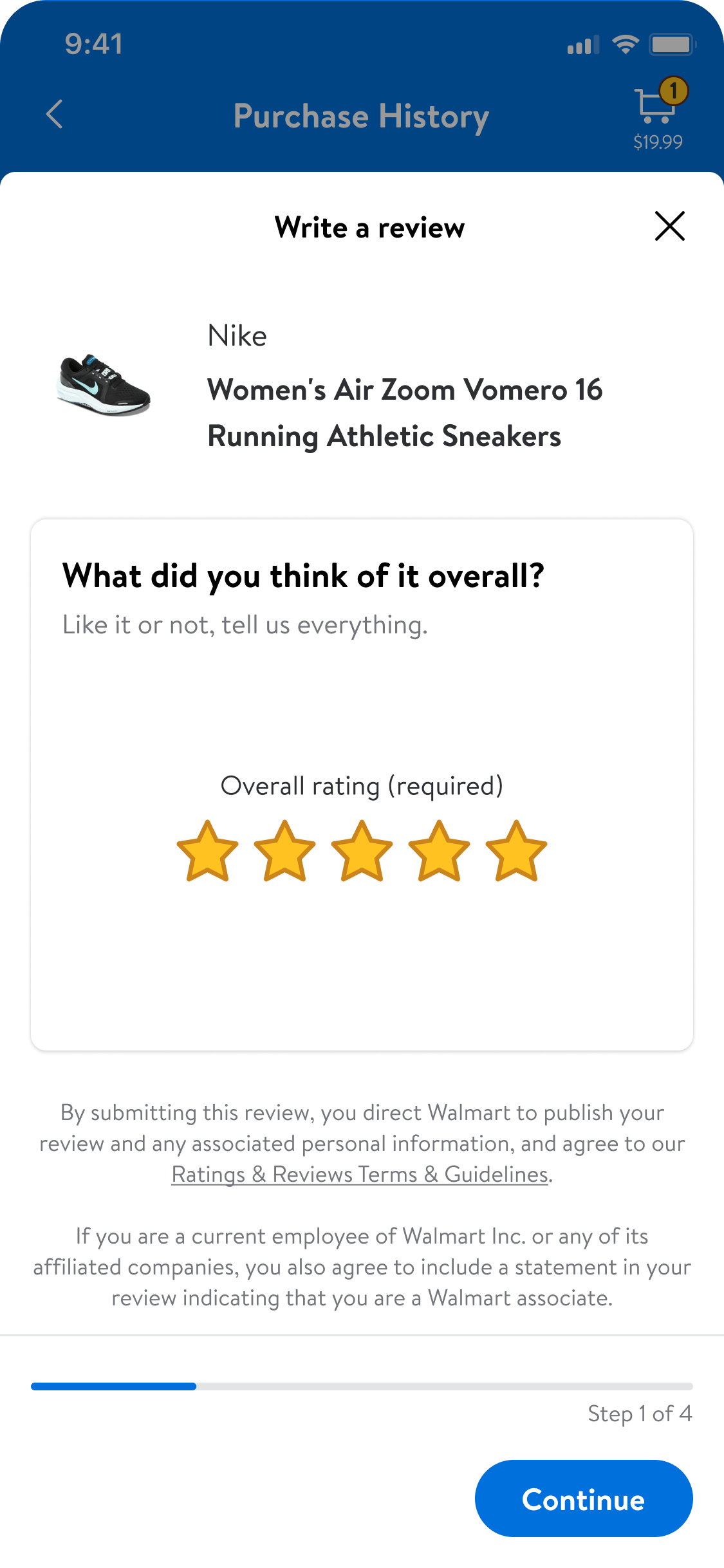
Option 2: Wizard
Section 1
Overall rating
Section 2
Images
Section 3
Feature ratings
Section 4
Review
Section 5
Personal details
Accordion concept


Wizard concept


group
user testing
Testing my solutions
Two rounds of unmoderated testing with 38 participants validated key design choices and revealed areas for clarity and engagement. Each participant tested both prototypes in a randomized order to prevent bias.
Testing insights shaped the final MVP scope, confirming high-value inputs while refining content structure and interaction patterns for better engagement.


First round of user testing
Users found the Wizard less cluttered and overwhelming, while the Accordion felt more flexible and faster to complete.
Key design insights for the next iteration:
Include a progress bar
Prioritize input fields users are more likely to complete
Second round of user testing
The results remained close but revealed clear evidence of order bias. Key insights from this testing informed our final hybrid solution:
Add sticky bottom buttons for easier navigation
Prioritize simple response questions
Provide additional context for sensitive inputs
Accordion

Wizard

editor_choice
Final Design
The optimized flow
After finalizing the review structure, I worked with product and engineering to refine implementation, ensuring feasibility across verticals while maintaining consistency. The final design combined the Accordion’s flexibility with the Wizard’s clarity.
BEfore
After
Ensuring clarity and ease of navigation
Users complete as much of the form as they choose, with design elements offering clarity and control.


An effortless first step
The required initial step is presented upfront to reduce friction. Auto-saving their input ensures no data loss if users exit before completion.
Be delightful
Delight users with subtle animations of the stars populating.
why it matters
A positive and engaging start can boost completion rates.


be vertical specific
Ensure adaptability with a clear and intuitive structure.
why it matters
Ensures relevant feedback without sacrificing usability.
Balance depth and simplicity to appeal to all users.
why it matters
Giving users flexibility reduces drop-off and encourages completion.


Enhancing decisions with relevant details
Inputs like size and weight help users make informed decisions, especially in categories where reference points are crucial. These also lay the foundation for an Apparel profile.
be vertical specific
Captures tailored inputs, recognizing apparel’s need for personal data.
why it matters
Builds trust and improves decision-making for future purchases.


monitoring
impact
The results
What I learned from this project
handshake
Aligning differing priorities between teams led to a collaborative design solution that met both needs and delivered meaningful results.
reviews
Detailed, relevant reviews foster trust, enhance experiences, and support better decision-making for users and businesses.
published_with_changes
Challenging assumptions about user preferences uncovered insights that reshaped the design and reinforced the importance of adaptability.
trending_up
Launching an MVP showcased the benefits of simplicity and iteration, with later enhancements reinforcing the value of continuous improvement.
work
Next Case Study

