XM On-the-Go


The Problem
When active in the field, expense management is not always top of mind. The overarching behavior is to quickly take a picture of a receipt and move on, or pocket a receipt and deal with it later. The process is then cumbersome when completed after the trip is finished.
However, submitting expenses for consultants and business travelers is an essential part of their job, and therefore should be a more seamless part of their routine.

Defining the Solution
The objective was to create a mobile app that enables the capture of expenses on-the-go. By providing a quick and easy method to record expenses, organize them, and submit them in a report for reimbursement, expense management would become simple and convenient.
In the workshop with the client, user types were established and their problems and needs were discussed. The different types of expense types and features for the app were defined. What could be included in the scope for the MVP version of the app was then established.

The MVP
As the first release of the product, the functionality only includes the ability to create expenses for taxis, individual/group meals, trains/rails, and parking/tolls. Users are then able to add those expense types and corporate card transactions to expense reports and submit them.
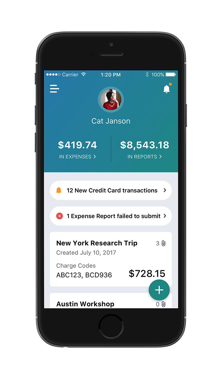
To allow users to quickly record their expenses, the interface needed to be minimalist, intuitive, and direct. For fast and easy access, the floating action button contains the most frequently used actions: creating a new expense report, creating a new expense, and capturing a receipt.

Creating a New Expense
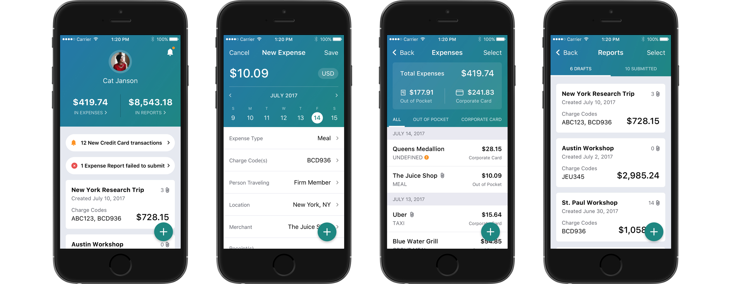
Users can create a new expense through the FAB directly or by first capturing a receipt. To make the process as simple and as fast as possible, everything that users need to fill out is accessible on this screen.
The calendar also defaults to the current week and both the Person Traveling and the Location fields are prepopulated to decrease the level of effort to complete the expense.

Unattached Expenses
Expenses that have not yet been attached to an expense report can be found on the Expense screen. An overview at the top summarizes the total expense amount and then breaks it out by whether its an out-of-pocket or corporate card expense. The tabs below it allow users to filter them, making it faster to find the desired expense.
As users scroll, they are still able to filter as the summary section collapses and the tabs become sticky at the top. The date headings are also sticky for their individual sections, so users will always know what date the expense occurred on.

Leveraging Native Functionality
A common mobile user interaction is to swipe left or right on something. Leveraging that common user behavior and native functionality, users are able to swipe on an expense to perform actions quickly.
Swiping left allows users to archive that expense, whereas swiping right enables them to easily attach it to an expense report. Users are also able to tap on an expense to view or edit its details.

Attaching Expenses to Reports
Besides swiping on an expense, users are also able to select one or more expenses to perform an action on it. After selecting the desired expenses, users are able to add it to a new report, add it to an existing report, or archive the expense.

Expense Reports
Users are able to access their draft and submitted reports on the Reports screen. Each card contains a summary of essential information about the report, making it easy to get a quick overview of its progress without viewing its detail screen.

Crafting an Expense Report
Like the Expenses screen, the Draft Report screen has a summary of what's in the report at the top. Below that are all the expenses that have been added to the report listed chronologically.
As users scroll, the overview section collapses to display the name and total expense amount of the report. This allows users to maintain context while browsing what's in the report.

Contextual Navigation
While the FAB permanently contains the three most common actions of the application, it also can contain contextual actions. For example, on the Draft Expense screen, the additional action of attaching an expense is included in the list because it is a frequent action of that screen.
The idea of contextual actions teaches users to trust that the most important actions on that screen will be found in the FAB. This empowers them to use the app quickly and efficiently to accomplish what they need to while on-the-go.

Award Recognition
DesignRush recognized XM On-the-Go as one of
The Best Android and iOS App Designs
